Customer research
Testimonials: the best and worst ways to use them
Why walls of customer quotes often go unnoticed, and how video, clear highlights and well-placed social proof can work harder.
Thank you so much for joining me for the first edition of UX Que Converte! Your trust means a lot to me. It really does.
I'll be sending you articles about creating effective digital interfaces, drawing on what I've learned over more than a decade helping hundreds of companies in Brazil, the US and Europe.
We'll talk about design, copywriting, analytics, audience research, neuromarketing, experimentation... Whatever it takes to turn visitors into customers, and customers into fans.
How many testimonials or customer reviews do you come across every day?
They're on landing pages, app listings, ecommerce sites... But do they actually influence your decisions?
The truth is that most companies use testimonials haphazardly, without thinking about the best way to present them.
And if you display them badly, people may simply ignore them. They become useless, or may even hurt your results.
Let's look at how to avoid that mistake and turn your testimonials into real conversion drivers.
How NOT to do it
The most common way to display testimonials is to stack them in blocks of text like this:
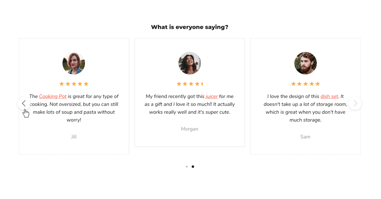
But here's the problem: most users ignore this kind of content.
Like you, your audience sees countless testimonials every day. They're in a hurry, and they're unlikely to stop and read three or four paragraphs written by strangers.
A whole screen of three paragraphs of testimonials from people they don't know probably won't be interesting enough to read.
After more than 15 years analysing heatmaps, session recordings and usability tests, I can tell you: text blocks like these almost never get much attention.
Worse, in some cases they can make users stop scrolling before they've finished reading the page. This is especially true of long testimonial sections.
If you have a testimonial section like this on your site, check your heatmap tools. I bet very few people interact with it.
How to do it right
I'm certainly not saying you shouldn't use social proof such as testimonials.
Testimonials are powerful, but only when you use them well.
Take a look at what Wiz does on its homepage:

Several interesting things are happening here:
✅ A short, unobtrusive video, with sound off by default, featuring a real, well-produced testimonial.
✅ A prominent, impactful quote, so the message gets across even if you don't watch the video.
✅ The customer's name and job title, adding credibility to the testimonial.
✅ Simple navigation between testimonials, showing the logos of major companies and making it easy to discover more social proof.
And remember: you can show that your customers love you without necessarily quoting their testimonials. Let's look at a few examples:
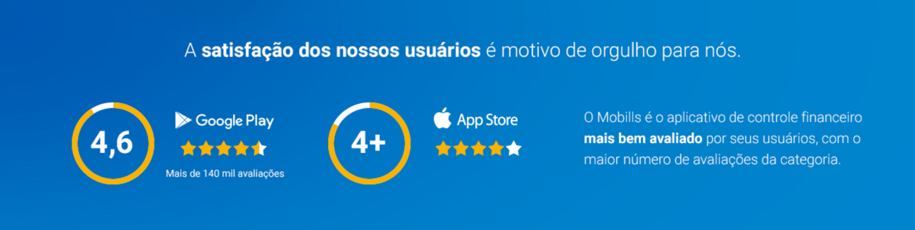
Mobills highlights its app-store ratings and the fact that it's the highest-rated app in its category.
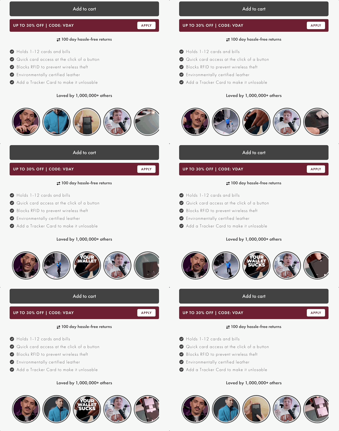
Wallet maker Ekster places short clips of customers using its products near the purchase button on the product page.

On a page Supersonic created for Twilio SendGrid, we highlighted some well-known customers in the most visible element on the page: the headline.
Conclusion
Testimonials are a powerful form of social proof, but their impact depends directly on how you present them. Displaying them generically, in long blocks of text, will lead to disinterest and low conversion.
More creative approaches, such as short videos, highlighted quotes, relevant information about customers and other visual elements, make testimonials much more effective.
Whatever format you choose, the important thing is to make sure users notice and value the testimonials.
Review how your company uses them, test new approaches and see the difference.