Conversion and UX
A close look at Nubank’s conversion strategies
An October 2020 review of Nubank’s acquisition, homepage, product pages and sign-up form, with test ideas around motivation, value, friction and trust.
Originally published in October 2020.
Although still relatively young, Nubank already has significant achievements behind it. It's currently the strongest example of the revolution fintechs can bring to Brazil, attracting millions of satisfied customers, including me. It was also recently named one of the world's 50 most innovative companies by Fast Company.
That makes Nubank the ideal candidate to launch this series, in which we'll analyse the CRO, or conversion rate optimisation, techniques of some of Brazil's biggest fintechs.
We'll examine not only the best conversion techniques these companies use, but also opportunities they could still explore.
Whether or not you work directly in fintech, the aim is for you to leave inspired by insights from companies operating in one of digital marketing's most competitive and innovative environments.
Shall we begin?
The criteria for the analysis
To ensure every analysis in this series uses the same perspective, we'll assess how, and whether, fintech websites apply elements we know influence a website's or landing page's conversion rate.
Let me explain:
Over our years doing CRO for companies in Brazil, the US and Canada, we've identified dozens of elements that affect conversion rates positively or negatively, all scientifically validated through our tests.
These elements fall into 5 main groups:
1. Motivation
Motivation elements connect the solution being offered with the user's immediate need.
If users can't quickly and clearly see that you can solve the problem they're trying to address right now, the one that brought them to your website, your chances of conversion fall.
2. Value proposition
What benefit are you offering, and why should users choose you over any similar option? Value-proposition elements answer those questions.
3. Incentive
People always have plenty of reasons, rational or otherwise, to postpone a decision. Incentive elements help persuade users to convert now rather than later.
4. Friction
Elements in the fourth and fifth groups should be avoided because they hurt conversion rates.
Starting with friction: every obstacle you put between users and conversion, such as a long form, confusing messages or slow pages, creates friction. The more friction elements you have, the lower your conversion rate.
5. Uncertainty
Finally, users feel uncertainty when they aren't 100% sure which path to follow or whether they're making the right decision. Should they trust your company? Will your product make their lives better? Is it easy to use?
There we are! Now that we've explained conversion elements and their roles, let's see how they appear, or don't, on Nubank's pages.
Starting at the beginning: where do Nubank's visitors come from?
You can't assess a company's conversion effectiveness without first understanding where the people interacting with its pages come from.
For Nubank, a few things about its traffic sources stand out from a CRO perspective:
Strong branding, backed by numbers
You probably know that Nubank does an excellent job with branding. Its brand is admired and attracts significant interest from the public and the media.
That quality is visible in two characteristics of its website audience.
First, Nubank's share of direct traffic, which includes people typing the website's URL directly, is enormous:
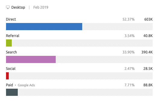
Around half its users already know the website and type its URL directly.
The second characteristic demonstrating its branding quality appears in its second-largest traffic source: search engines.
The vast majority of users' search terms relate directly to the Nubank brand, known as "branded searches":
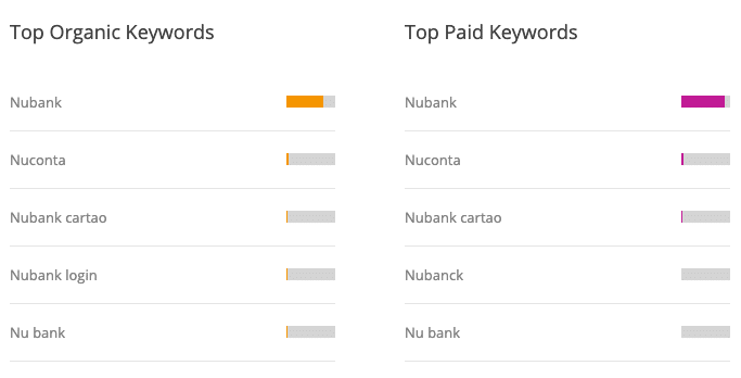
Many people think branding and performance or conversion are separate worlds, often rivals. The reality is very different.
When a company has a strong brand like Nubank's, conversion work becomes much easier. More people have heard of you, more already understand what sets you apart, and more trust you. Persuading them to buy is a less difficult challenge than usual.
Mobile-first. Really.
It shouldn't surprise anyone that most of the website's traffic comes from phones. After all, this is a company built around an app.
But the gap between mobile and desktop traffic might surprise some people:
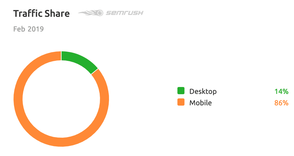
Yes, almost 90% of the traffic is mobile, according to SEMrush.
That matters greatly to our analysis. Every conversion page needs to prioritise the experience and persuasion of mobile users, whose characteristics differ considerably from desktop users'.
Nubank takes this into account with a website that clearly prioritises mobile interaction.
That's already great! But the icing on the cake would be dedicated versions for desktop and mobile.
Being mobile-first doesn't have to mean giving up an excellent desktop experience. Nubank's website, for example, is essentially responsive, adjusting its size from mobile to desktop. At times, that creates a certain "waste" of space:
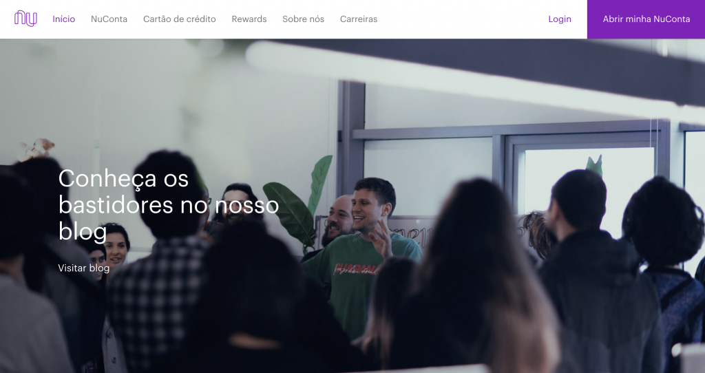
At least on the desktop website, many of these areas could be used to test strategies we'll discuss later in this article.
Growing paid traffic
Nubank seems to have recently decided to step on the paid-traffic accelerator, pressing the pedal further down each month:
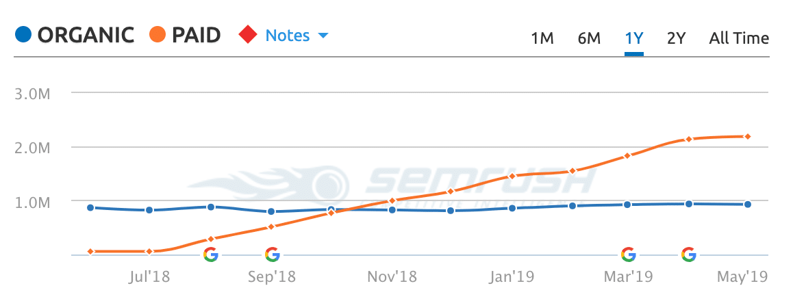
This is important for CRO because, as paid traffic grows, you stop bringing in only people already engaged with the brand. You start receiving more top-of-funnel visitors, to whom you first need to introduce yourself and demonstrate trustworthiness.
Below, we'll discuss how Nubank handles this, and how it might do even better.
Page analysis: homepage
Now that we understand a little more about Nubank's traffic, let's finally analyse the conversion strategies on its main pages, starting with the homepage.
[MOTIVATION] A great headline. But about the right thing?
Nubank's homepage has a good headline, which is already rare online:
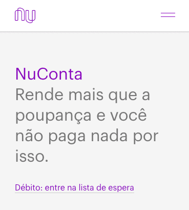
It presents a product with a powerful benefit that persuades users to stay. In other words, the headline does its job.
The question is: is Nubank presenting the right product above the fold, in the part of the homepage users can see without scrolling?
Notice that the first screen is 100% focused on NuConta. But the product users arriving at this page search for most, by far, is the credit card:
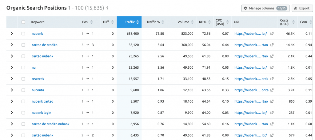
Yet the credit card is only mentioned on the second screen, which many users never reach.
You don't need to be Sherlock Holmes to imagine that Nubank is strategically much more interested in promoting NuConta than its credit card.
Even so, if we want users to at least decide to hear us out, rather than bounce a few seconds after arriving, the best strategy is to align the beginning of our page as closely as possible with the motivation that brought them there.
To follow that practice, Nubank could present the credit card above the fold as a "hook" telling users: "I have what you're looking for. You're in the right place." Only then would it introduce NuConta into the sales pitch as an offer that creates even more value for someone who initially only wanted to learn about the credit card.
This change could be particularly effective considering that the first call to action currently shown is "Debit: join the waiting list". That could be problematic for much of the traffic arriving at the page because:
- Visitors are interested in a credit card, not a debit card.
- Like all of us, users prefer immediate solutions. Joining a waiting list isn't as attractive as receiving an immediate benefit.
- Some users may assume the credit card also has a waiting list. If they need it urgently, that could put them off.
Even though Nubank doesn't present the ideal product above the fold, its current strategy is still better than the obvious solution of "showing a carousel with every product". Avoid carousels.
[UNCERTAINTY] "Should I trust Nubank?"
As we've seen, many people arriving at Nubank's homepage already know the company. But we've also seen that its media investment is growing. To maintain rapid expansion, it will increasingly need to reach people who aren't as ready to convert, aren't early adopters and are less familiar with the company and its value proposition.
For an example of some users' distrust, look at searches related to the term "Nubank":
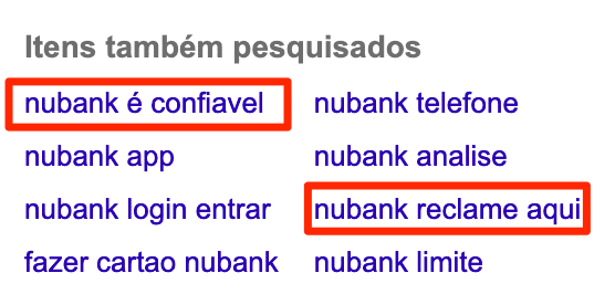
Yes, 25% of this sample of 8 frequent searches relates to users' distrust.
So for a growing proportion of visitors, the name "Nubank" doesn't mean much. For them, it's ESSENTIAL that the site credibly demonstrate the company's trustworthiness. We're talking about financial products, a market in which trust is everything.
How can it earn that trust?
There are currently virtually no authority, trust or social-proof elements on the homepage, making this improvement a major low-hanging fruit. Nubank certainly doesn't lack facts it could use to demonstrate trustworthiness. A few examples:
- The number of customers it serves.
- Specific media recognition, such as this.
- Company awards.
- A chart showing its monthly growth rate, because people want to be part of "trends".
[FRICTION] What's clickable?
This point deserves a mention because even excellent mobile interfaces sometimes get it wrong.
Clicking the areas containing product names on Nubank's homepage takes you to a page with details about the relevant product.
The problem is that they don't look clickable:
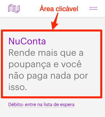
The only area that appears clickable is the text below: "Debit: join the waiting list".
The resulting friction is that someone who wants to learn more about NuConta before deciding whether to join a particular waiting list may not realise more product information is available on another page.
[UNCERTAINTY] What should I do now?
We've seen that Nubank offers both NuConta and its credit card on the homepage. So far, so good.
The problem is that it doesn't make clear which path users should follow if they want both products, as many do.
With the current organisation of information, where the arguments for each product are completely separate, many users will conclude that they must choose one or the other. That's an unnecessary choice to impose on them. After all, Nubank obviously wants every user to get every product.
Page analysis: paid-media landing page
Most Nubank ads currently direct users to this landing page.
It's another good page, and gets more conversion elements right than the homepage. That suggests it may have been tested against the homepage as the paid-traffic destination and won.
[VALUE PROPOSITION] Facing the competition
One of the things I like most about this page is that it doesn't ignore the competition.
Believe me: countless entrepreneurs and marketers make this mistake. They think they're infinitely better than their competitors and shouldn't even compare themselves with them. In 99.99% of the cases I've seen over 15 years in marketing, that's a serious mistake.
This page understands that Nubank competes directly with traditional banks and takes a clear comparative approach in places like this:
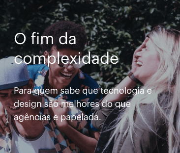
Used well, comparisons help conversion enormously. I believe Nubank could even go further, comparing clearly and directly how it differs from traditional banks.
One of the most effective visual solutions is a comparison table.
In Brazil, cultural factors often make company executives uneasy about direct approaches like this. But we've successfully used comparison tables in several Supersonic projects where they made sense.
For example, here's how we did it for Rádio Academia, a specialist music service for gyms:
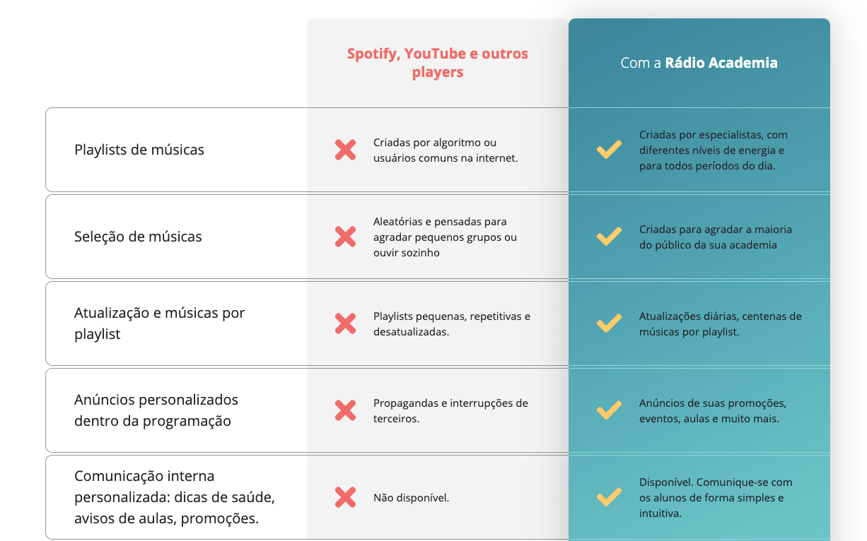
Nubank could explore several comparisons with traditional banks in a table like this: fees, returns, customer-service quality, bureaucracy... It would be an excellent way to make its advantages obvious to every kind of audience.
Product-page analysis
Nubank has created specific pages for its products: NuConta, Credit Card and Rewards.
The pages use several interesting strategies and also offer many opportunities for experiments. Let's look at some.
[VALUE PROPOSITION] Customer-service quality
It's interesting that Nubank barely mentions customer-service quality as a differentiator on its product pages.
Obviously, I'd need to carry out a market diagnosis to measure this advantage's power with any precision. But from my own social experience, customer-service quality is one of the things I most often hear other Nubank customers praise.
Considering that most people have had unpleasant experiences with customer service at Nubank's main competitors, traditional banks, emphasising this benefit strongly and credibly could plausibly produce good results.
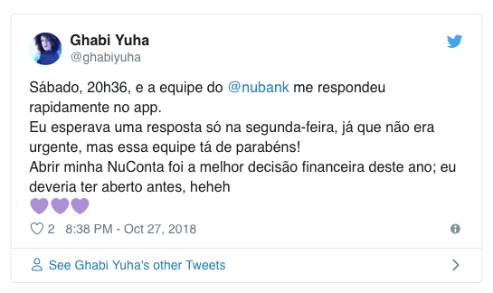
At present, it's mentioned very timidly and out of the way, as in this testimonial:
Speaking of testimonials...
[VALUE PROPOSITION] Making better use of testimonials
You've probably heard in a million places that "putting customer testimonials on your pages is good".
There are countless CRO myths passed around as truths. But THIS one really is true. Testimonials add social proof to your pitch, making it more credible and reducing users' uncertainty.
The same set of testimonials, however, can be used in a merely "OK" way or in a "fantastic" way.
Nubank has chosen to present Twitter widgets, as in the last image above, in a specific area of the page.
The positive side is that this gives the testimonial greater credibility. Users can click the widget's links and see that the person really exists and really said those things.
Like you, users don't believe every testimonial they read. Inventing testimonials is a very common tactic among scammers, who flood the Brazilian internet. For that and other reasons, people are increasingly sceptical, and "proof" strategies like Nubank's matter.
What could be improved is that all the testimonials are concentrated in one area.
Think about your own experience: do you usually read everything in the testimonial sections of product pages you visit? Probably not.
Our diagnostic work shows that most people behave that way. Areas that concentrate lots of testimonials are usually ignored.
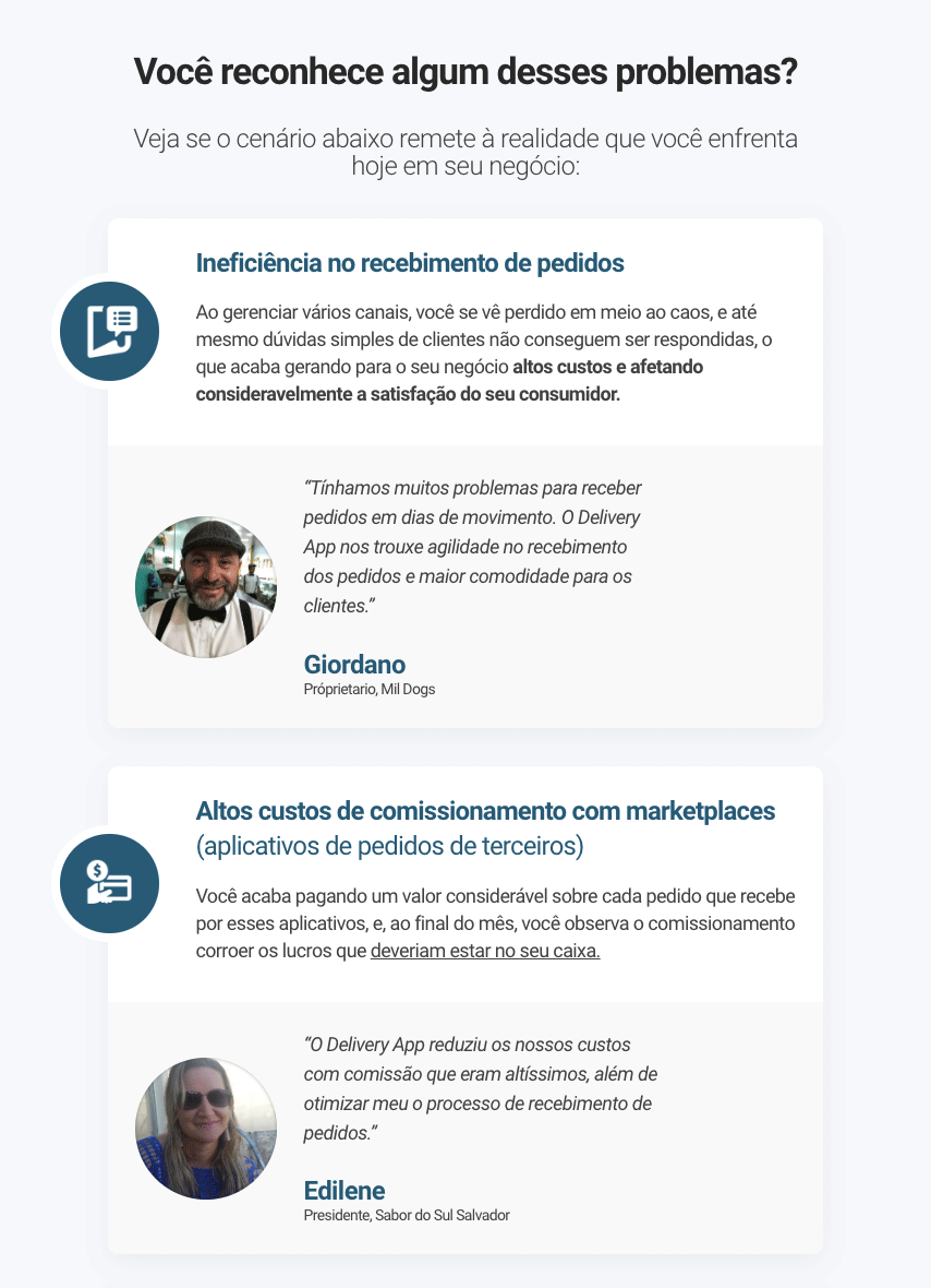
One way to address this is what I call "contextual social proof". Testimonials are spread throughout the page alongside content specifically addressing the issue each customer is praising.
For illustration, here's how we used testimonials contextually to support the solutions our client Delivery App offers restaurant owners:
Conversion-form analysis
Last but not least, let's discuss the final interaction that 100% of converting users must complete successfully: filling in the conversion form.
[UNCERTAINTY] What happens next?
Uncertainty about what happens after conversion is a major source of anxiety. "Will I be charged?" "Am I making a commitment?" "When will I receive what I'm buying?"
These and other questions need clear answers to prevent uncertainty. The greater the uncertainty, the less likely conversion becomes.
Nubank's credit-card application form gives no information about how or when the card will be sent.
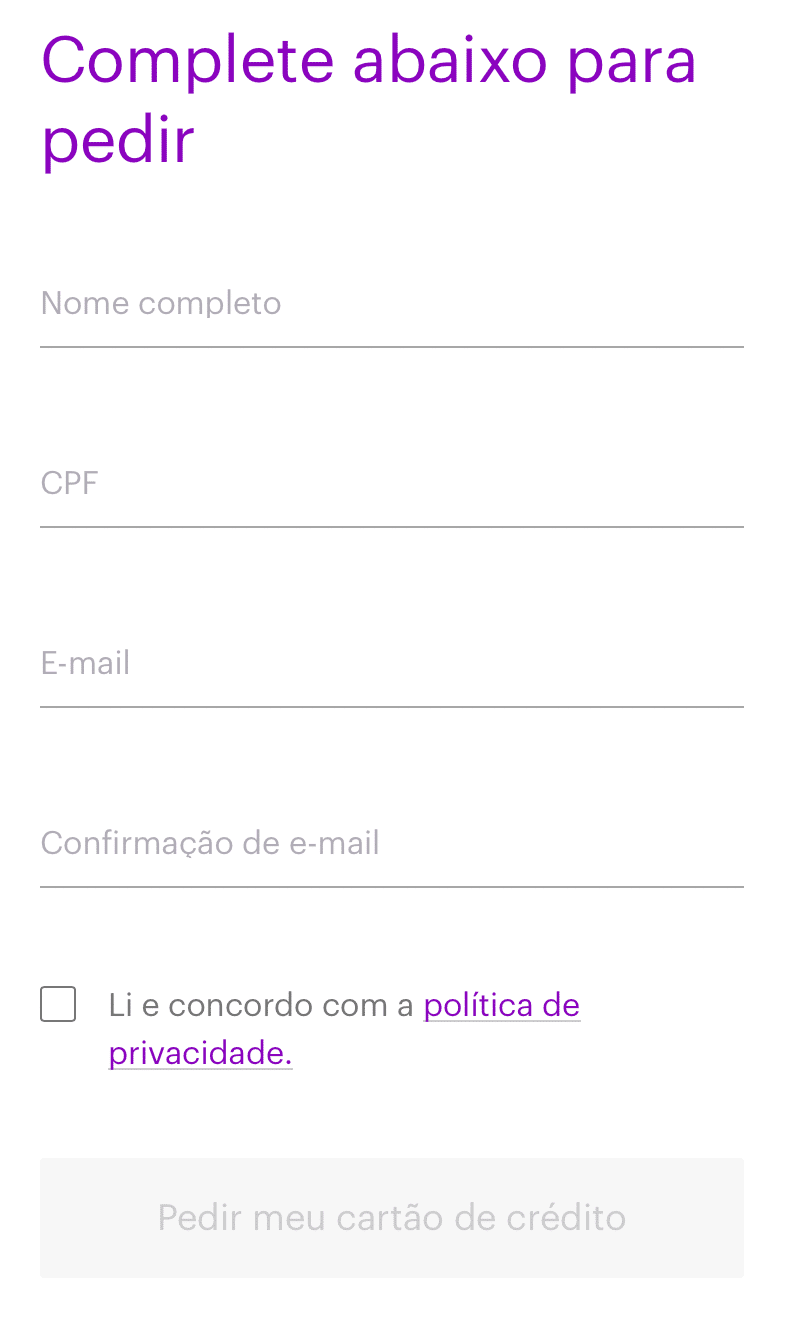
That information may currently be given after users complete the form. That's much better than never explaining it at all. But not having it on the form at the exact moment of the conversion decision is certainly increasing overall uncertainty.
[FRICTION] Small details with a big impact
Filling in your form is the moment when NOTHING can go wrong. Users must NOT become lost. Think of it as the most decisive moment in their entire buying journey. Countless things had to go right for someone to finally decide to complete the form and become a customer.
Every "small" usability detail that can make this interaction easier and more accurate therefore matters enormously.
Nubank does a great job with several form best practices, such as real-time validation and showing the correct mobile keyboard for each field: a numeric keyboard for the CPF, Brazil's individual taxpayer number, an email keyboard for the email field and so on.
What could still improve:
The CPF field has no input mask to insert the full stops separating groups of digits:
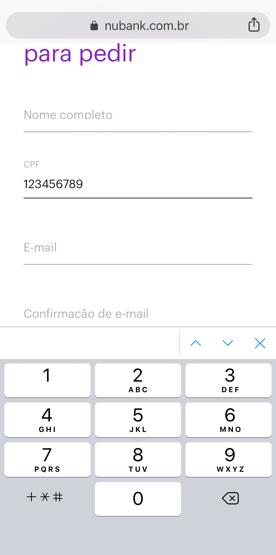
That makes it harder for users to check whether they've entered their CPF correctly.
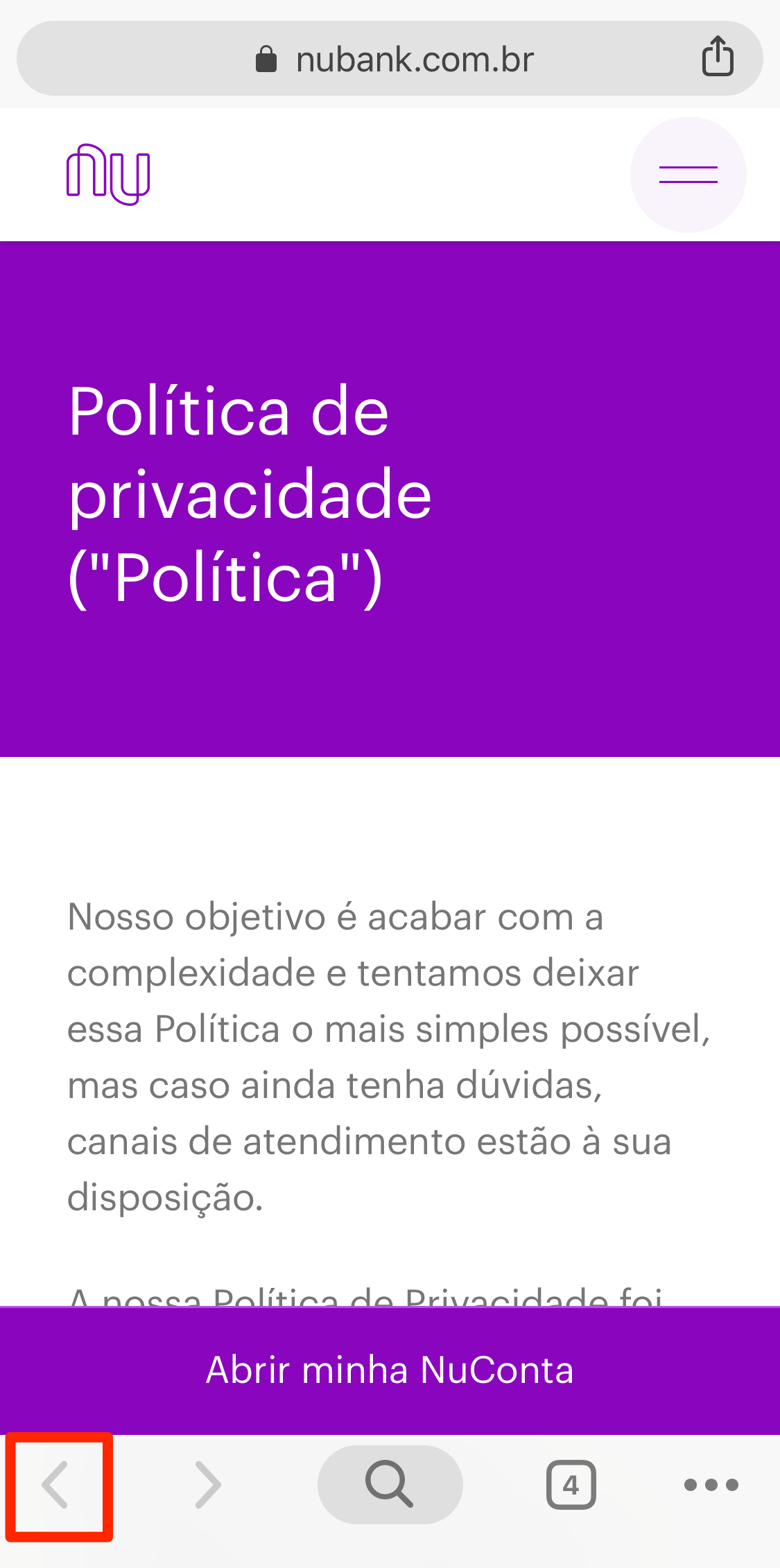
Another detail is that the link to the privacy policy users must accept opens in a new tab.
That might seem harmless, but some less experienced users get lost trying to return to where they were, because the browser's back button is disabled in a new tab.
Final considerations and caveats
This article aims to identify optimisation opportunities on Nubank's pages and generate insights for readers facing similar challenges. But Nubank's digital marketing work is excellent. It's certainly among Brazil's top 1% of companies in this area. Every website will always offer opportunities for optimisation experiments, even the best ones.
This is a quick, informal analysis I carried out independently, without access to employees, internal data, audience research or the company's strategic plans. Don't take everything presented here as the most precise and absolute truth. It certainly isn't.
As always, if you want to implement any suggestion here in your own business, I strongly recommend doing so through an A/B test. High-level digital marketing has no room for "blind" changes without a scientific experiment showing precisely what results the change produces.
I originally wrote this article for the Supersonic blog.