Conversion and UX
Booking and a subtle scarcity tactic
Why would a hotel-booking site show rooms you cannot book? A look at an unusually subtle use of scarcity.
Booking.com is a global reference for the aggressive use of "scarcity", a psychological trigger designed to persuade users to act, and buy, NOW rather than later.
You can't browse the site without encountering countless messages meant to accelerate your decision, such as "High demand in [CITY] for your selected dates" or "Only 2 rooms left!"
These strategies work, but they aren't exactly innovative. Countless other websites do precisely the same thing.
Booking also uses a subtler scarcity tactic that users often don't notice.
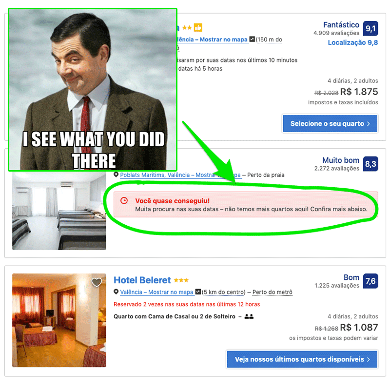
Have you ever wondered why on earth Booking includes hotels that are already fully booked for your selected dates in its search results, as shown in this article's image? That doesn't help you at all, right?
I've heard this question several times while discussing Booking's techniques in talks and classes.
The answer lies in creating a feeling of scarcity.
When you see unavailable options at your destination, you'll naturally tend to "feel" that demand is high for your dates and that the best options are running out. Even if that isn't true and your trip is a year away.
It's a change that's "controversial", to say the least, but certainly produces positive results for Booking.
Booking is one of the world's most mature companies in CRO processes. Everything in its website interface will have been tested and scientifically shown to generate positive business results.
Would you use the same technique if you were responsible for a similar website? Have you seen or used any other scarcity strategy that breaks with convention?